
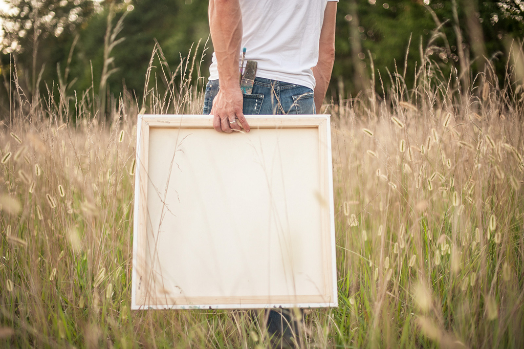
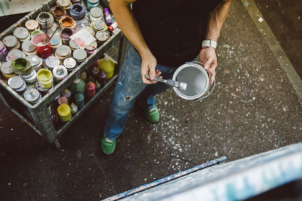
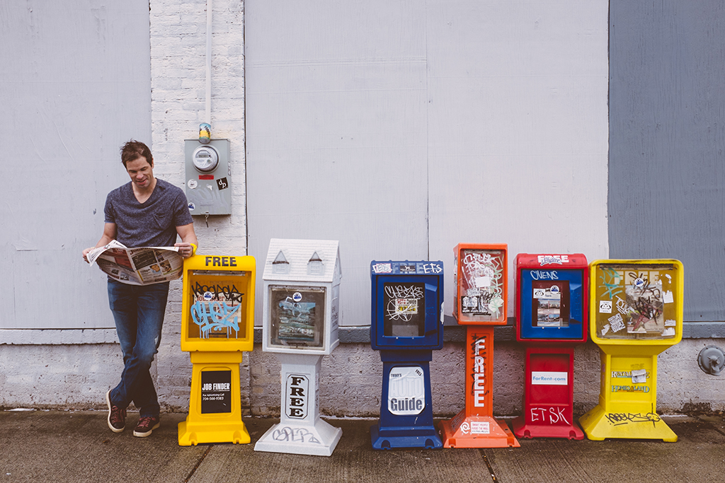
Kent Youngstrom shared the importance of the element of surprise on Monday. Today, he gives six ways to keep your product fresh and creative!
Cindy Crawford’s mole. Megan Fox’s weird thumbs. Harrison Ford’s scar.
All things that perhaps these celebrities are known for, but not necessarily what you would be staring at if you met them in person.
And Megan, just a side note, but thumbs aren’t really that important to me.
And why am I not staring at her thumbs?
Because she has other, more attractive features like fantastic eyebrows and high cheek bones that take my eyes away from even noticing.
They are not the focal point of her overall look.
They don’t dominate.
When you first meet someone, view a new work of art or double tap on a styled photo – where do your eyes travel to first?
What is the first thing you see?
What grabs and holds your attention?
Whatever it is that grabs and holds your attention like a southern momma bear, hugging her grade schooler after a week away at summer camp, is the focal point.
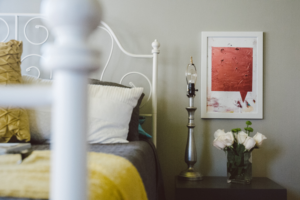
In any composition, a focal point is that specific part of an area of emphasis to which the artist draws the eye. And it is true that a focal point is often spoken of when referring to art work.
So blow your budget on the focal point. You are not buying groceries for the week. Find one thing that will surprise my eyes and grab my attention.
Dominate my line of sight.
A focal point is achieved by using dominance.
I’m not talking Christian Grey dominance here.
It’s a dominance that creates a visual lead in and guides the viewer to other parts of a space.
Every design should have a gripping area of dominance that serves as a ticket to explore its surroundings.
So how do I achieve this dominance? How do I surprise my audience (without wearing a leather cat suit)?
Here are six simple rules:
1. CONTRAST
Think Sesame Street signs – which of these things is not like the other (this must be read in a sing songy tone).
Or contrasting colors. Complementary colors provide a high level of contrast. You can cheat and use a color wheel to find colors located directly across from each other. Red + green, blue + orange, and purple + yellow are all examples.
2. SIZE
Size matte… never mind, that’s way over used. And under used actually. Try something larger than you think necessary for the space you are in. Or go the opposite. Less can be more – see below.
3. COLOR
Love things simple and white? Throw some color just one place. Or obsessed with color everywhere. But black and white can grab your eye like a sale tag on a pair of Jimmy Choo’s.
4. DENSITY
Maybe your favorite store is Costco. You like things in bulk. I can be guilty of that in my studio. Clumping images together is a great way to direct the eye. It works well for Gray Malin in his photography.
5. VALUE
Not value as in an original kenT youngstrom vs. a giclee kenT youngstrom print value.
Rather, a value that refers to the intensity of an object. How much “heat” is that thing putting off.
A hot pink scarf may draw attention more than a subdued one.
6. WHITE (EMPTY) SPACE
I hope you are not among clutter right now. But if you are – look around. Do your eyes have a place to rest?
Are your eyes desperately darting back and forth looking for a place to land? White space on your wall, on your shelf and on your desk give your iris’s a place to rest. They need nap time too.
Less is more. Famous saying, I know.
Visual clutter. It happens.
But it doesn’t have to.
You are in control young jedi.
The less you see the less you will be distracted. Duh!
“Simplicity is about subtracting the obvious and adding the meaningful.”
– John Maeda
Double duh, obviously – right?
The simplest images are often the most surprising.
My writer friend Alexandra Franzen says it this way.
“rolls out like love rhymes with yes ends with a sigh
like there’s nothing to do except let it all ride
ride out that ssssssss till you’ve emptied your lungs emptied your mind hollow like a bottle filled with sunlight or starlight your choice just don’t settle for anything less than the best
capture the best let go of the rest
do you need that? not in the slightest not unless
it rhymes with yes, bless, caress let it be simple let it be pure let it be love let it be less.”
However, if all else fails, just go with the leather cat suit.

Make sense?
Whatever your style is.
Grab it.
Own it. Splurge on it.
You and your project deserve it.
Spend money to make money.
Look good to feel good.
And as my mom used to say, “for Pete’s sake, be your own logo.”
Which meant – be yourself, not what your shirt says you are,because we all know that logos are awesome. . . if you are a giant company that resembles a red fruit that grown on trees,
if you sell burgers, or if you are a 14-year-old girl and need validation.
I remember my jr. high days. For reasons from acne breakouts and other weird body changes to emotional instability, I would choose to skip those torture hours completely.
One thing I have a strong memory of is having to have the right logos on my clothes. I just wasn’t cool if there wasn’t a horse with a polo player, an “s” on my watch with its proper rubber band protector, a bugle boy patch, an OP, a Nike symbol and so on. Yes, you can now guess my age.
To this day, I have developed a hatred for horses, alligators, whales, and swooshes.
We, the billboard-touting junior highers, of course graduate to adulthood and continue to validate ourselves with our favorite branding marks. We so often replace individual style with a khaki collision of branded wear that proves that we can follow in line and obtain what the guy next to us can – or can not.
What do you stand for?
Who are you behind that shirt?
Would or should I wear something you are wearing – not literally, but figuratively?
What is your mark?
If someone were to sum you up in an image, what would it be?
Try this: pretend you are walking into a prestigious ad agency to meet with their hot, young design team. They want to brand you and funds are not an issue. This is pro bono work.
How do you start the meeting?
What do you tell them about yourself to have them capture you and everything you stand for?
Think big picture. No one cares if your favorite color is pink, that you adore tulips, love long walks on the beach and that you think Prince is the greatest rock star of all time (well, maybe the Prince thing.)
Think more like I’m purple rain in a world of storm clouds. I look for the good in others and rejoice more in their successes than my own.
They won’t have a long time to meet with you. They have a lot of clients on the books – you will need to be precise and succinct. Go. Come up with it. Then be it – but never let anyone else wear it.
Take this advice I throw out to folks who want to be creative or make things for a living and apply it to your specific project. Are you just copying someone else’s work? Is it pretty because it looks like something from your favorite magazine?
That is of course all fine and good. But what makes your work different from other designers, artists or stylists? Why would I choose your work over someone else’s?
Be you. Sing like pretty woman in the bathtub. It surprises people.
Website / Instagram / Facebook / Pinterest

comments