

The School of Styling founder, Kaitlin Holland, will be teaching a few sessions in Chapel Hill. First, she’ll be exploring the principles of design through two hands-on sessions “Fundamentals of Design Demonstrated Through Flat Styling” + “Creative Tabletop Styling.” She will also lead a breakout session called “Social Media Marketing: Turning Followers Into Fans & Fans Into Clients.”
Today, Kaitlin is here to share three tips for using color in a tabletop design to make it pop!
Tabletop designs are such a fun way to express personality and creativity. While you might not be an event planner or stylist, everyone sets their table! I love that attendees have the opportunity to play around with a variety of design elements through a simple tabletop. Today, I’m going to focus on one design principle: color. We’re going to look at three images (all past TSOS student work!) and dissect a few key ideas that will help your tabletop pop! If you join us at TSOS Chapel Hill, you’ll be able to create your own designs and practice the use of the design principles.
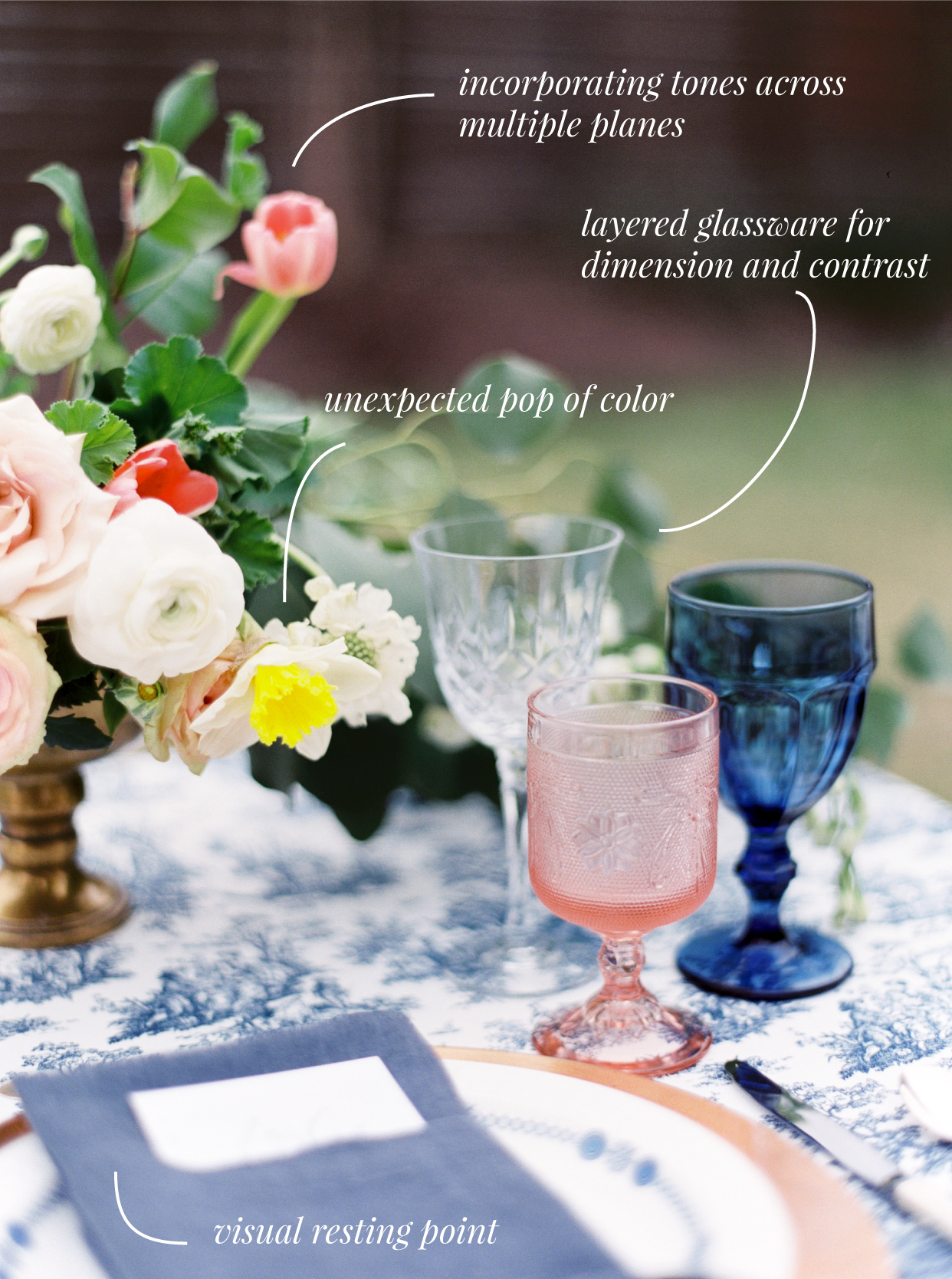
Incorporate your palette across multiple layers.
One thing I love about the image above is how Meg incorporated her color palette in multiple layers. She used blush in the glassware (plane 1) and her centerpiece (planes 2 + 3). Because her centerpiece design has so much depth, it actually creates two layers of color rather than just one.
The same can be said of her use of navy. There’s navy incorporated in the tablecloth (plane 1), the napkin (plane 2), and the glassware (plane 3). The use of blush and navy throughout the design gives it depth while maintaining cohesion. It also gives the design freedom to include pops of color like the bright yellow flower.
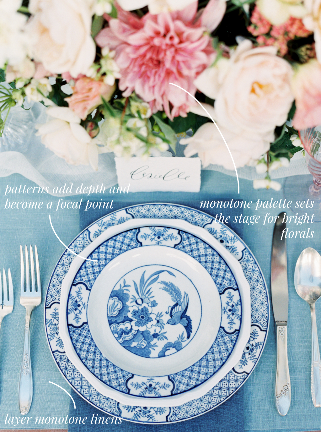
The power of monotone colors.
Monotone colors are colors all within one color family. In the design above, Natalie chose to keep her palette in the blue family. Some people tend to stray away from this because they are afraid it will look “blah.” Obviously, it doesn’t have to!
How can you make a monotone palette successful? Choose different tones and variations of the same color. If she had used the exact same tablecloth and napkin this wouldn’t be as successful. By choosing a lighter toned linen (with a slightly different color variation) and a darker napkin, it keeps the blues from running together and sets the stage for the china.
The layered blue and white china is ultimately what makes this successful. Because both of the linen choices are solid, it helps to incorporate pattern to make the color feel fresh and new again! Think about using a small or more intricate pattern if you are using large blocks of color (like the linens).
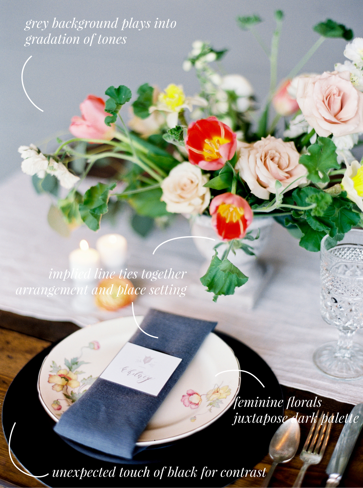
Don’t be afraid of contrast!
Everyone has their different style and aesthetic, but I challenge you to experiment with contrast at least a few times. My soft-palette-loving self would have never gravitated toward this dark black charger, but oh my gosh, this is done so well!
Upon first inspection, the black charger and bright red and yellow flowers make quite the statement. But when you look more closely at Caroline’s design, you can see why it’s successful. She didn’t just throw in visually heavy and bright colors without balancing them.
Between the black charger, charcoal napkin, light grey runner, and mid-tone wall, the black actually makes sense. It ties in nicely with the other tones represented in the image. (This is another great example of the first point.)
And while the red and yellow is definitely a show stopper, it doesn’t stand alone. The soft red, pink, and yellow tones found in the salad plate, along with the softer pinks and yellows in the flowers, help tie the red in so it doesn’t feel disjointed. Don’t be afraid to throw in some visually interesting color choices, but be sure to give it thought so it doesn’t feel random or haphazard!
We would LOVE to see you in Chapel Hill this October! If you want to read more about the curriculum, investment, venue and more, visit the Chapel Hill page here!
Photography by Love, The Nelsons

comments