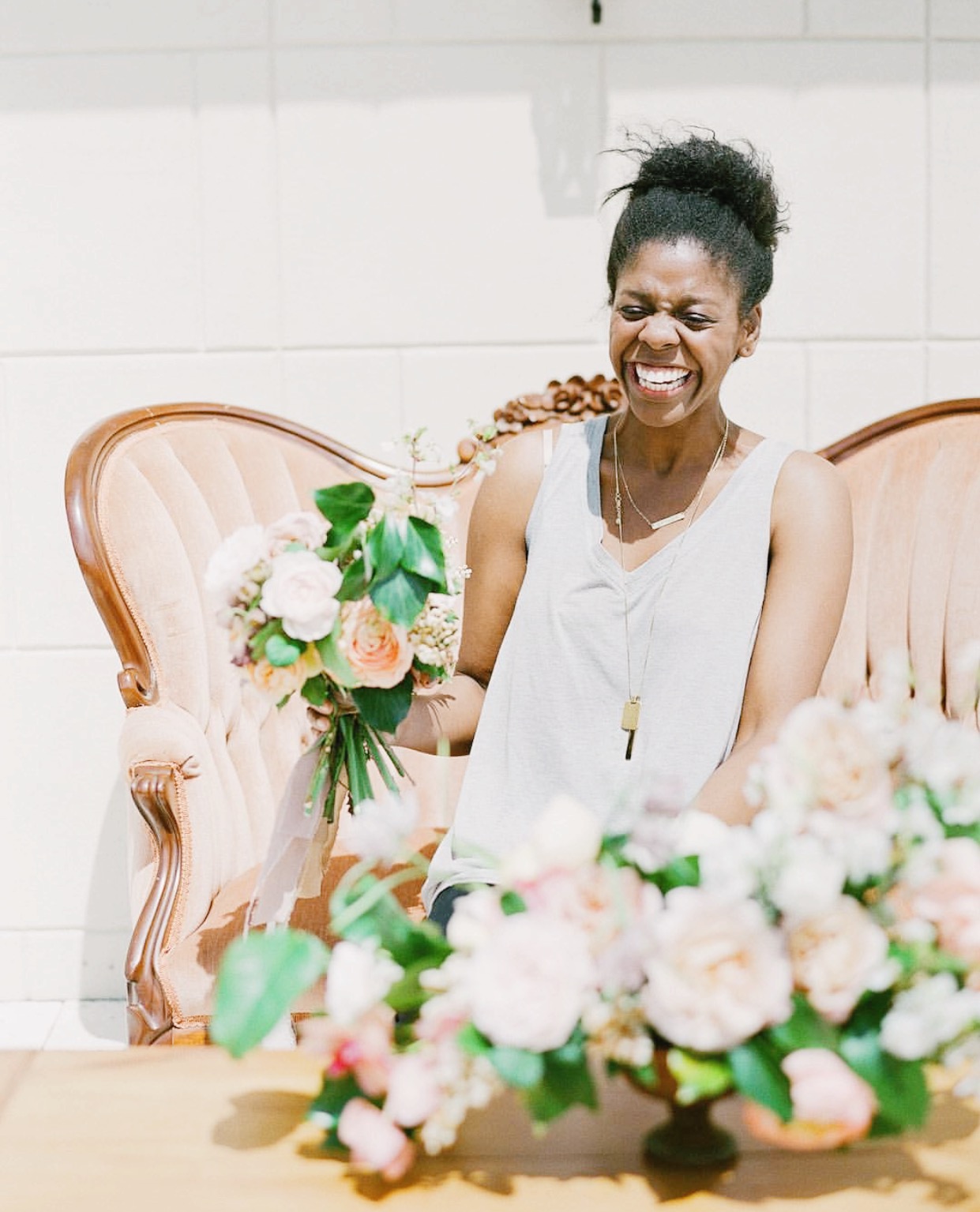
Kaylyn Hewitt, floral designer extraordinaire, will be joining us this fall in Chapel Hill to teach a session called “Centerpiece Design: Honing Your Design Eye Through Flowers.” Each attendee will get the opportunity to put these principles (and more!) into practice through the creation of their own centerpiece. Ally and Bobby will then capture beautiful film images for attendees to use in their portfolio. Even if you aren’t a florist, this session will be sure to stretch you creatively. Below, Kaylyn is sharing three of the design principles she will cover more in-depth in October!
I have a few tried a true design principles that can be applied to almost an style, in any medium, and at all levels. They are what I go to when I get stuck or feel uninspired and they keep my designs grounded. I find it helpful to have a road map that allows room for creativity and exploration. At the School of Styling in Chapel Hill we’re going to apply these three principles and dive into all the details and and nuances of floral design. It’s going to be such a fun time.
Line and Movement
Flowers have a way of telling you how they’d like to be used. They’re full of hints and clues as to how they can best be showcased in design. When I’m designing, one of the first things I think about is how best to create lines and movement in a piece. Some flowers, like ranunculus and poppies, have these obvious stems that create leans and swirls in pieces. Other flowers, like roses or peonies, have the biggest blooms but leave a lot to be desired when creating lines or movement. What’s important to remember is that all of these flowers can work towards creating movement in a piece. Using implied lines (three roses at different levels) and actual lines (ranunculus stems extending far behind the vessel) you can create really beautiful pieces that are visually stimulating and interesting.
Color
I’m enamored by color. I’m convinced the folks at Pantone have the dream job. There’s so much complexity and variation in color and I could get lost in all the shades and hues. As florists, we have so much at our fingertips. Nature has given us these amazing hues that can work together, point to each other, or compliment each other in ways that are hard to replicate in other mediums. My approach to color is pretty simple, I love fluidity. I love using color in such a way that leads to the next flower or, if I’m using all the same color, how each shade can be made most useful amongst the others. In our design class, we’ll talk about the importance of color and how it can be used to elevate your designs.
Focal Point
In all fairness, I truly believe that every flower has the potential to be a focal flower. I don’t think there’s a list of flowers that can be designated “focal flowers” or another one for “accent flowers”. However, I do believe in focal points and using them in a way that strengthens your designs. What you do not want in your designs is your flowers competing with one another. Flowers do not compete in nature, so you don’t want to impose that on them in your arranging. To avoid this, choose a flower that you’re working with to be the focal point in that piece. Where is the eye going to rest (focal point) and what lead it there (your implied lines or actual lines)?
Early Bird ends TOMORROW at 2:00 EST! Want to enroll? You can here!
comments